A good question from the Effective Altruism group on Facebook: "why EAs [people in the effective altruism community] often think that making changes to their personal lifestyles in order to reduce factory farming is worth it while hardly any EAs seem to think that making changes in their personal lifestyles in order to reduce global warming is not worth it."
Here are some guesses:
Wednesday, June 19, 2013
Monday, March 11, 2013
Weierstrass Elliptic Function
I was reminded of Weierstrass' elliptic function by John Cook's recent post about elliptic functions:

(where  are the points of a lattice in the complex plane).
are the points of a lattice in the complex plane).
The technique of adding up one term for each lattice point is really neat, and it's extra great that the function turns out to have such amazing properties.
Since John's post showed what pretty pictures come from using phase portraits to visual complex functions, I decided to make a video to show me what the partial sums that converge to the Weierstrass function. I'm adding a bunch of terms starting from the origin going outward, but you could add the terms in any order.
The picture on the left is a zoomed in version showing two periods in each direction. You can see the function getting more periodic as we add more terms.
The code is here. The code is O(n^2) (where n is the number of terms I want images for) when it really should be O(n), since I'm in effect asking for a lot of repeated computation by making each image separately. Sorry!
Sunday, August 5, 2012
Visualize a random forest that classifies digits
My last post uses random forest proximity to visualize a set of diamond shapes (the random forest is trained to distinguish diamonds from non-diamonds).
This time I looked at the digits data set that Kaggle is using as the basis of a competition for "getting started". The random forest is trained to classify the digits, and this is an embedding of 1000 digits into 2 dimensions preserving proximities from the random forest as closely as possible:
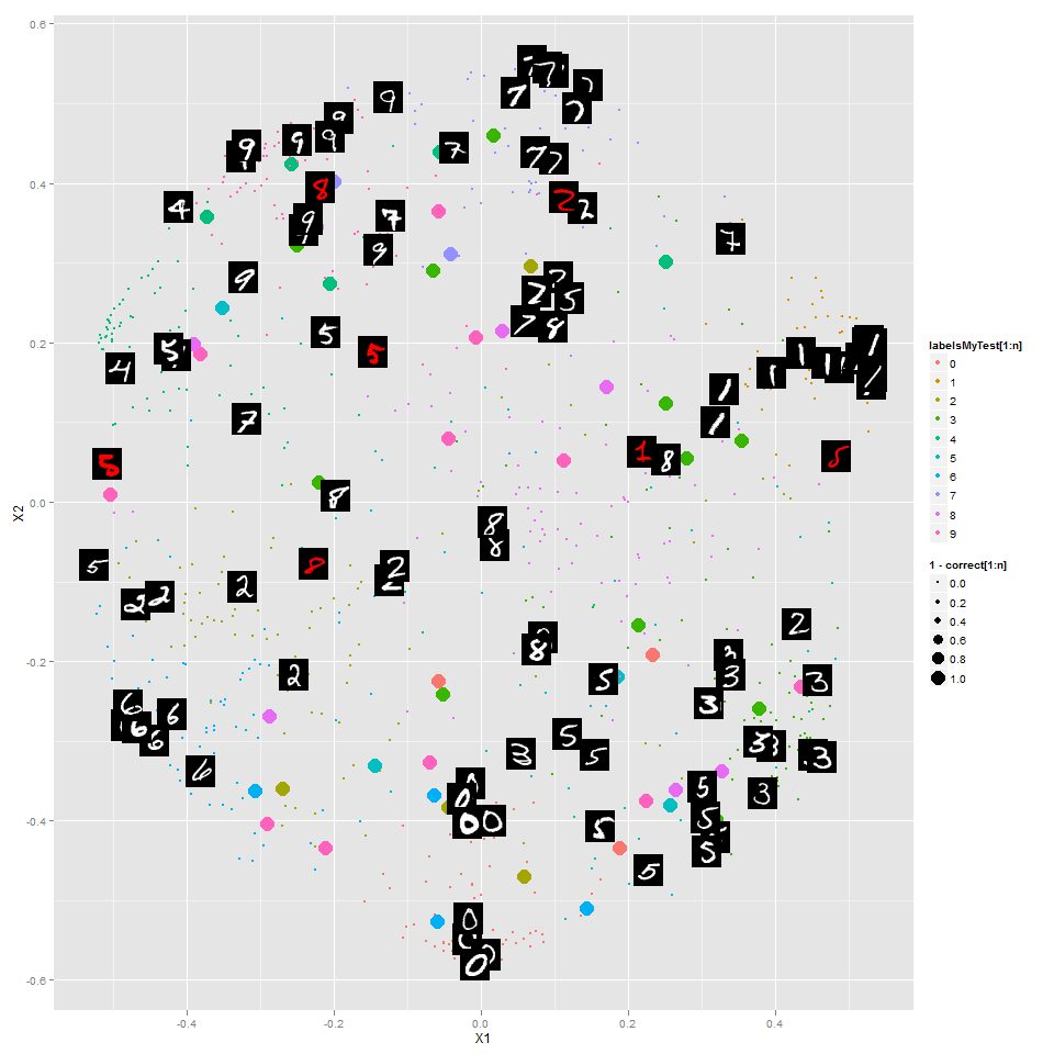 The colors of the points show the correct label. The larger points are digits classified incorrectly, and you can see that in general those are ones that the random forest has put in the wrong "region". I've shown some of the digits themselves (instead of colored points) -- the red ones are incorrectly classified.
Here's the same but just for the 7's:
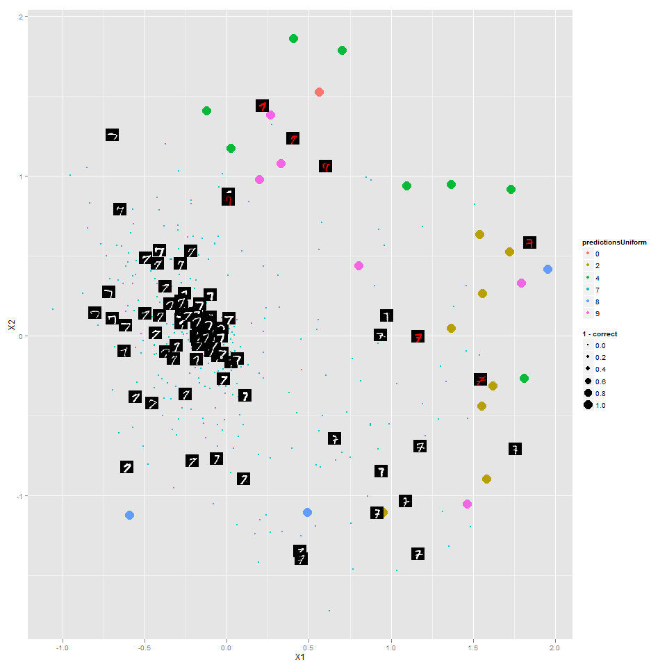
The random forest has done a reasonable job putting different types of 7's in different areas, with the most "canonical" 7's toward the middle.
You can see all of the other digits http://www.learnfromdata.com/media/blog/digits/.
Note that this random forest is different from the one in my last post -- here it's built to classify the digits, not separate digits from non-digits. I wonder what kind of results a random forest to distinguish 7's from non-7's would look like?
Code is on Github.
This time I looked at the digits data set that Kaggle is using as the basis of a competition for "getting started". The random forest is trained to classify the digits, and this is an embedding of 1000 digits into 2 dimensions preserving proximities from the random forest as closely as possible:
Here's the same but just for the 7's:
The random forest has done a reasonable job putting different types of 7's in different areas, with the most "canonical" 7's toward the middle.
You can see all of the other digits http://www.learnfromdata.com/media/blog/digits/.
Note that this random forest is different from the one in my last post -- here it's built to classify the digits, not separate digits from non-digits. I wonder what kind of results a random forest to distinguish 7's from non-7's would look like?
Code is on Github.
Random forests for visualizing data
Recently I read about using random forests as a way to visualize data. Here's how it works:
- Have a data set
- Create a set of fake data by permuting the columns randomly -- each column will still have the same distribution, but the relationships are destroyed.
- Train a random forest to distinguish the fake data from the original data.
- Get a "proximity" measure between points, based on how often the points are in the same leaf node.
- Embed the points in 2D in such a way as to distort these proximities as little as possible.
I decided to try this in a case where I would know what the outcome should be, as a way of thinking about how it works. So I generated 931 images of diamonds varying in two dimensions:
- Size
- Position (only how far left/right)

Then I followed the above procedure, getting this:

Neat! The random forest even picked up on a feature of this space that I wasn't expecting it to: for the same difference in position, small diamonds need to be closer to each other than large diamonds. None of my diamonds have a diameter smaller than 4 pixels, but imagine of the sizes got so small the diamond wasn't even there -- then position wouldn't matter at all of those diamonds.
I set one column of pixels to random values, and the method still worked just as well. (Which makes sense, as the random forest only cares about pixels that help it distinguish between diamonds and non-diamonds.)
A cool technique that I'd love to try some more! For one, I'd like to understand better how it differs from various manifold learning methods. One nice feature is that you could easily use this with a mix of continuous and categorical variables.
Note that starting with Euclidean distance between images (as vectors in R^2500) and mapping points to 2D doesn't seem to produce anything useful:

Code available on github.
Tuesday, July 10, 2012
Tweaks to Instapaper "Read Later" Button
I love Instapaper (please support it by becoming a premium member!). Being able to easily save articles for reading later lets me move the article-reading time from when I shouldn't be getting distracted to when I'm happy to relax on the couch (or train, or airplane, or line at the coffee shop, ...) with an interesting article.
Tonight I worked on fixing two small things that were bugging me:
Tonight I worked on fixing two small things that were bugging me:
- When I'm reading an article, I'd like to know where I came across it. The code below uses the javasript "document.referrer" property and adds a link back to the referrer, before saving to Instapaper.
- It now adds a bit of text like: "################### Referred from: http://en.wikipedia.org/wiki/Blog"
- I don't like when I hit "Read Later" before the page has finished loading and get a complaint that I should wait for the page to load. This lets me hit "Read Later" while it's loading and get back to ordering my coffee.
You can use the code below just like the original "Read Later" link, but I'll warn you it's had about 5 minutes of testing. Please give me any feedback you have!
I'd like to have much more extensive history/referral tracking, and even what it's supposed to do now doesn't always work. Let me know if you can help!
Saturday, April 21, 2012
Chrome is smart about "back" and redirects?
This website I made creates an image based on the parameters in a URL. For example, this url:
http://www.plannedpooling.com/?stitches=65&Color_1=CA2835&Stitches_1=13&Color_2=DD39DE&Stitches_2=16&Color_3=F271B5&Stitches_3=15&type=flat&number_colors_input=3&comment=&old_n_colors=3
...creates this image:

If you go to "http://www.plannedpooling.com/" (with no parameters), I'll make up some parameters and redirect you a URL like the one below. Unfortunately, this creates a frustrating e xperience with the "back" button (that I'm sure you've experienced elsewhere).
I feel bad about it, but I'vese never fixed that. Probably the best thing would be to make up parameters and show the corresponding image at the root url, without redirecting. Still, I haven't changed that. Sorry world!
But I wondered: Why can't browsers be smart enough to know that when you press the "back" button, you don't want to go back to somewhere that's going to redirect you again.
Then I noticed that Chrome is that smart! Try it: http://www.plannedpooling.com.
IE 9 and Safari on my iPad are not that smart, but Safari on my iPhone goes "back" to where I was previously, just like Chrome.
Does anyone know how this is actually working? Does Chrome know that that page redirected me and then not even think about going back to it? Or does it check what's there, and when it sees the redirect decides instead to go back even further? Or something else?
Monday, December 19, 2011
Visualizing ChaLearn Gestures Test Data
The colored paths are labeled training data, just like in my last post on this.
The title gives the "answer" for a test video:

Could you tell from just this what the sequence of gestures was?
Not perfectly, but way better than chance.
See a couple more examples by clicking:


I'm sure that a prediction method based only on these principal components isn't the best way to go (is it ever? except for reducing the size of your problem for computational purposes), but I'd like to try -- then at least I can visualize my algorithm very nicely and see where it's failing.
And a few more (first ten from "devel01" test data) here (pdf, not an animation).
The title gives the "answer" for a test video:
Could you tell from just this what the sequence of gestures was?
Not perfectly, but way better than chance.
See a couple more examples by clicking:


I'm sure that a prediction method based only on these principal components isn't the best way to go (is it ever? except for reducing the size of your problem for computational purposes), but I'd like to try -- then at least I can visualize my algorithm very nicely and see where it's failing.
And a few more (first ten from "devel01" test data) here (pdf, not an animation).
Sunday, December 18, 2011
speaking of machine learning
Umm, not exactly:


And "Albanian" doesn't come first ("Africaans") does, so it's not even that kind of bug.
Saturday, December 17, 2011
Defining Churn Rate--is instantaneous better?
I enjoyed this post on defining "churn rate" at the Shopify tech blog, though I don't remember at all how it ended up in my reading list.
The author goes through ways you might define define "churn rate", showing that each of them could be misleading.
Like a good ex-calculus teacher (from one year in grad school), I wondered: Isn't any "rate" more naturally understood as an instantaneous quantity? Doesn't the problem come from the fact that he's trying to understand churn over an interval first?
To illustrate, here's my oversimplified model:
- You start with some number of customers (initial_customers) at time t=1.
- Each day you gain new customers at some number of new customers, drawn from a Poisson distribution with expected value expected new customer rate.
- Each day you lose some proportion of your customers, drawn from a binomial distribution where the expected value of the proportion you lose is your daily churn rate.
I suspect that everything I say will apply also to more complicated/realistic models.
Here's a silly simulation (here's code for the simulation) of this model, where I've determined the expected churn rate (flat, then slopes up) and expected new customer rate (flat).
Churn rates:
 Daily number of customers:

Assuming your number of customers doesn't change too much in a day, the daily churn rate is almost like an instantaneous rate.
Here's a silly simulation (here's code for the simulation) of this model, where I've determined the expected churn rate (flat, then slopes up) and expected new customer rate (flat).
Churn rates:
Assuming your number of customers doesn't change too much in a day, the daily churn rate is almost like an instantaneous rate.
So, I have two notions of daily churn rate:
- Daily churn rate:
- Daily expected value of churn rate:
The definition he ended up with is an appropriate weighted average of daily churn rate and he must have been thinking of this.
Why take an average over a period? Because actual churn rates are noisy, so averaging is one way to smooth out that noise.
But once we're thinking in these terms, aren't there all sorts of standard time series methods for helping us model (and even project) churn rates?
In other words: Averaging isn't the only way to separate the "noise (randomness in churn) from the "signal" (expected value of churn).
I'd love to hear about anything I'm missing here. I've never thought about this before, so forgive me if I'm very confused.
Sunday, December 11, 2011
Visualizing Gestures as Paths
Kaggle is hosting an exciting new competition in which the object is to learn to identify sequences of gestures from just one example of each gesture. I would bet this competition has a lot of potential to attract academics interested in machine learning.
The competition comes with sample code for importing the datasets (AVI videos) to MATLAB, but right now I don't have MATLAB (although a recent post from one of my favorite bloggers reminded me to obtain it even before this annoyance).
The other tools I've used for data analysis are R and Octave (a free program similar to MATLAB). The best option I found for importing the data was Octave's 'video' package (see below the fold for installation tips). Please let me know if you find other possibilities!
The data come in batches, so I imported the first batch of data, saved it, and loaded it in R. When imported the data, I also shrunk each image, for two reasons:
Then treating each frame (image) as one "row" of data, plotted the first two principal components (of the training data only) as a 'quick and dirty' way to visualize the data. In this plot, the points represent frames, and the colors encode which video each frame came from:
 Observations:
All of my code for this is available on Github.
The competition comes with sample code for importing the datasets (AVI videos) to MATLAB, but right now I don't have MATLAB (although a recent post from one of my favorite bloggers reminded me to obtain it even before this annoyance).
The other tools I've used for data analysis are R and Octave (a free program similar to MATLAB). The best option I found for importing the data was Octave's 'video' package (see below the fold for installation tips). Please let me know if you find other possibilities!
The data come in batches, so I imported the first batch of data, saved it, and loaded it in R. When imported the data, I also shrunk each image, for two reasons:
- Smaller dataset is easier to deal with (shrinking each dimension by a factor of 3 shrinks the final dataset by a factor of 9).
- I also hoped that blurring the fine distinctions of a larger image might cause each video to trace out more of a continuous path.
Then treating each frame (image) as one "row" of data, plotted the first two principal components (of the training data only) as a 'quick and dirty' way to visualize the data. In this plot, the points represent frames, and the colors encode which video each frame came from:
- I was surprised the paths don't trace out paths that are more continuous.
- Although they do trace out somewhat continuous paths
- Each gesture/video traces out a somewhat distinctive path
- Most gestures/videos begin and in roughly the same region (this makes sense -- each video seems to begin and end with the person in roughly the same position).
- Probably it would make more sense to include the "test" data in my PCA.
- The real question is how much the appropriate segment of each path in the "test" data resemble the corresponding path in the training data.
- I want to visualize the data (and do my learning) with an embedding/transformation that makes more sense than PCA. Presumably there is some structure in the set of all images, and a method like Laplacian Eigenmaps or ISOMAP will presumably do a better job taking advantage of that.
All of my code for this is available on Github.
Subscribe to:
Posts (Atom)