Showing posts with label R. Show all posts

Wednesday, October 16, 2013

A Bayesian Model for a Function Increasing by Chi-Squared Jumps (in Stan)

This post will describe a way I came up with of fitting a function that's constrained to be increasing, using Stan. If you want practical help, standard statistical approaches, or expert research, this isn't the place for you (look up “isotonic regression” or “Bayesian isotonic regression” or David Dunson, whose work Andrew Gelman pointed me to). This is the place for you if you want to read about how I thought about setting up a model, implemented the model in Stan, and created graphics to understand what was going on.

Here's the source for this post, including markdown and and R code, and here's the Stan model it uses.

Many thanks to Naftali Harris for comments and insights on an earlier version.

I recently read a paper that Andrew Gelman wrote back in 1996 about theoretical considerations that can restrict model choice even “in the abence of data with minimal applied context”. As one example, he describes the problem fitting a function \( f(t) \) that is known to be increasing and where \( f(0)=0 \) and \( f(1)=1 \) are known. We estimate the function given noisy observations of its value at \( (N-1) \) equally spaced sample points \( \theta_i=f(\frac{i}{N}) \) (for \( i \in \{1,2,3,...,N-1\} \)).

What prior should we use for the \( \{\theta_i\} \)? It might seem like a reasonable “uninformative” prior would make the \( \{\theta_i\} \) independent and uniform on \( [0,1] \), with the restriction that non-increasing sets of \( \{\theta_i\} \) are given zero probability. But this turns out badly! Gelman notes that this prior on the \( \{\theta_i\} \) is the same as the distribution of the order statistics of a samples of size \( N-1 \) from the uniform distribution on \( [0,1] \). As the number of points in the discretization increases, the mass of the prior concentrates around a straight line, which will overwhelm the data.

To illustrate, here are some samples from this distribution, for various \( N \):

plot of chunk sample_from_restricted_uniform
This weird! Under the uniform distribution, each (legal) path is equally likely. That's why if we fit this model to noisy data, the maximum likelihood estimate (which is the mode of the posterior) would be reasonable. But it turns out that for large \( k \), almost all legal paths are basically straight lines, so the bulk of the posterior would be basically a straight line no matter what the data say. It reminds me a bit of statistical mechanics, which is largely about micro-level randomness determining macro-level properties. (I'm no expert, but I recommend this book.)

Sunday, August 5, 2012

Visualize a random forest that classifies digits

My last post uses random forest proximity to visualize a set of diamond shapes (the random forest is trained to distinguish diamonds from non-diamonds).

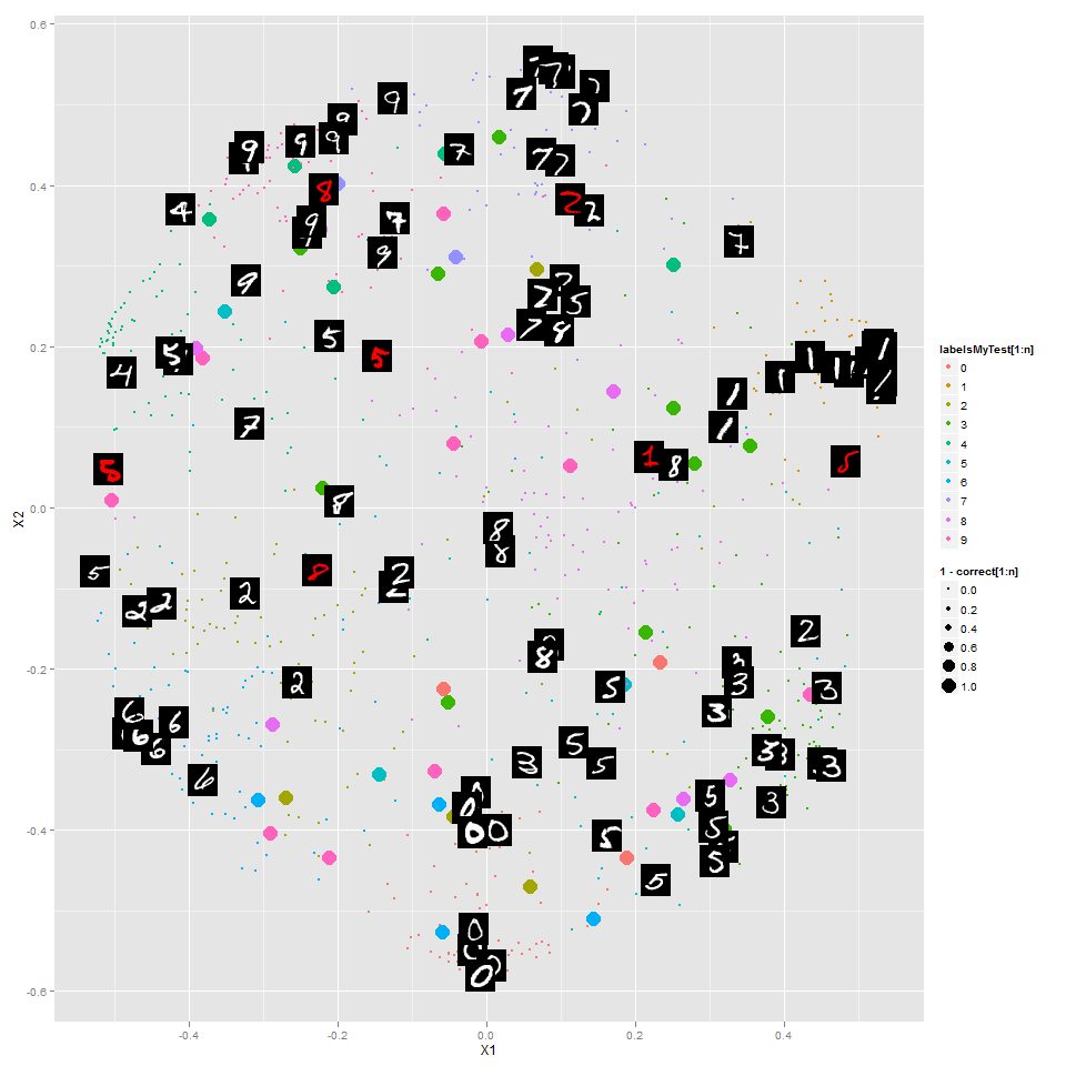
This time I looked at the digits data set that Kaggle is using as the basis of a competition for "getting started". The random forest is trained to classify the digits, and this is an embedding of 1000 digits into 2 dimensions preserving proximities from the random forest as closely as possible:

The colors of the points show the correct label. The larger points are digits classified incorrectly, and you can see that in general those are ones that the random forest has put in the wrong "region". I've shown some of the digits themselves (instead of colored points) -- the red ones are incorrectly classified.

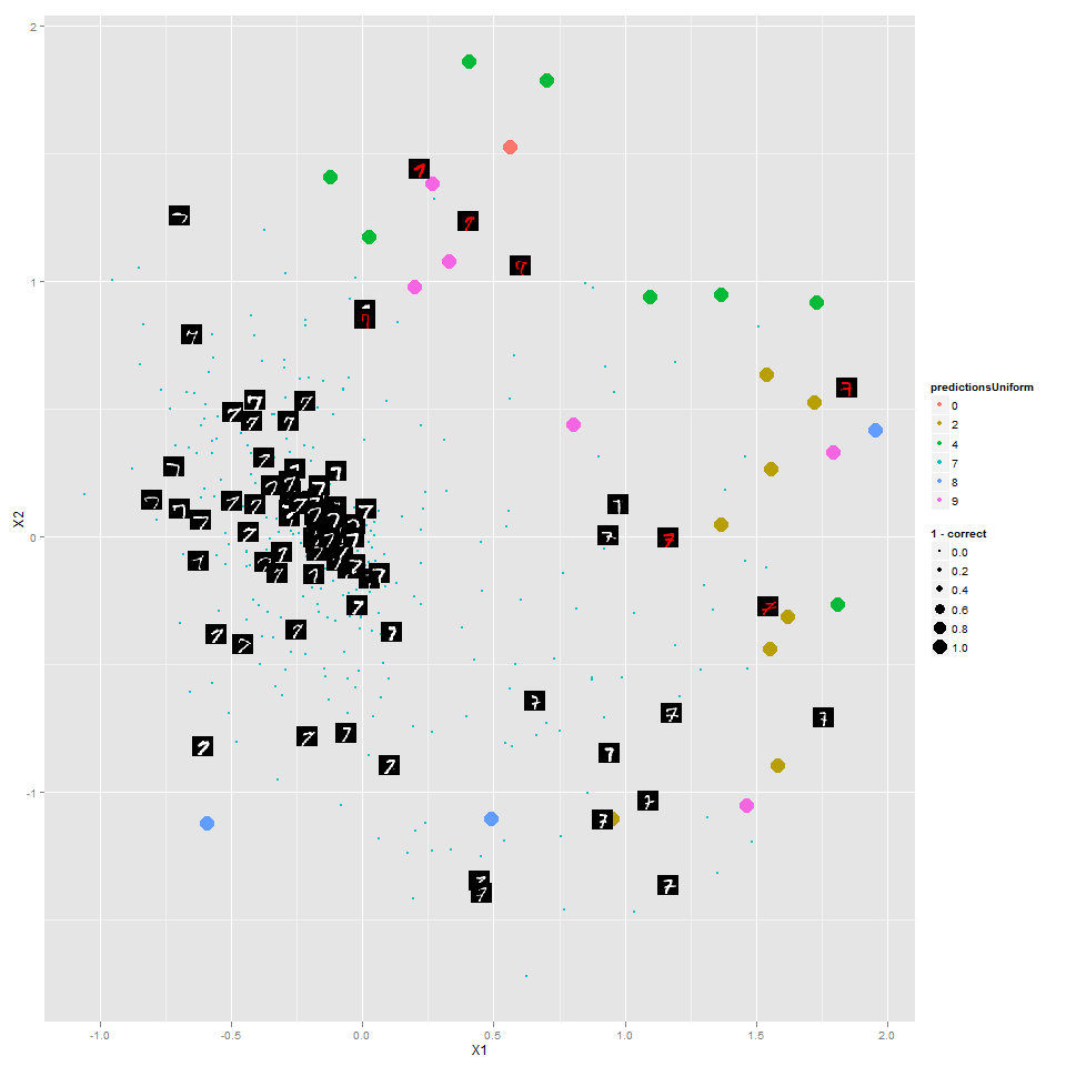
Here's the same but just for the 7's:


The random forest has done a reasonable job putting different types of 7's in different areas, with the most "canonical" 7's toward the middle.

You can see all of the other digits  http://www.learnfromdata.com/media/blog/digits/.

Note that this random forest is different from the one in my last post -- here it's built to classify the digits, not separate digits from non-digits. I wonder what kind of results a random forest to distinguish 7's from non-7's would look like?

Code is on Github.

Monday, December 19, 2011

Visualizing ChaLearn Gestures Test Data

The colored paths are labeled training data, just like in my last post on this.

The title gives the "answer" for a test video:


Could you tell from just this what the sequence of gestures was?

Not perfectly, but way better than chance.

See a couple more examples by clicking:


I'm sure that a prediction method based only on these principal components isn't the best way to go (is it ever? except for reducing the size of your problem for computational purposes), but I'd like to try -- then at least I can visualize my algorithm very nicely and see where it's failing.

And a few more (first ten from "devel01" test data) here (pdf, not an animation).

Sunday, December 11, 2011

Visualizing Gestures as Paths

Kaggle is hosting an exciting new competition in which the object is to learn to identify sequences of gestures from just one example of each gesture. I would bet this competition has a lot of potential to attract academics interested in machine learning.

The competition comes with sample code for importing the datasets (AVI videos) to MATLAB, but right now I don't have MATLAB (although a recent post from one of my favorite bloggers reminded me to obtain it even before this annoyance).

The other tools I've used for data analysis are R and Octave (a free program similar to MATLAB). The best option I found for importing the data was Octave's 'video' package (see below the fold for installation tips). Please let me know if you find other possibilities!

The data come in batches, so I imported the first batch of data, saved it, and loaded it in R. When imported the data, I also shrunk each image, for two reasons:
  1. Smaller dataset is easier to deal with (shrinking each dimension by a factor of 3 shrinks the final dataset by a factor of 9).
  2. I also hoped that blurring the fine distinctions of a larger image might cause each video to trace out more of a continuous path.

Then treating each frame (image) as one "row" of data, plotted the first two principal components (of the training data only) as a 'quick and dirty' way to visualize the data. In this plot, the points represent frames, and the colors encode which video each frame came from:

Observations:
  • I was surprised the paths don't trace out paths that are more continuous.
  • Although they do trace out somewhat continuous paths
  • Each gesture/video traces out a somewhat distinctive path
  • Most gestures/videos begin and in roughly the same region (this makes sense -- each video seems to begin and end with the person in roughly the same position).
Future possibilities:
  • Probably it would make more sense to include the "test" data in my PCA.
  • The real question is how much the appropriate segment of each path in the "test" data resemble the corresponding path in the training data.
  • I want to visualize the data (and do my learning) with an embedding/transformation that makes more sense than PCA. Presumably there is some structure in the set of all images, and a method like Laplacian Eigenmaps or ISOMAP will presumably do a better job taking advantage of that.


All of my code for this is available on Github.


Monday, April 18, 2011

pre-generate pictures of your knitting

[Update: I've made a website for this: http://www.plannedpooling.com/.]

This was a birthday present for my spouse. (Don't worry--I also covered a lot of things -- fruit/nuts/cocoa puffs/etc -- in chocolate. But I think both were appreciated!)

Sometimes people knit with with yarn that has a repeating sequence of colors -- for example, purple, then yellow, then green -- in a more-or-less regular repeating pattern. Most frequently, the colors in the finished product combine without making much of a distinguishable pattern (somewhat like the picture in the lower right, below). But sometimes stitches of the same color group together (as in the upper right picture), and sometimes other patterns emerge.

Inspired by someone at www.ravelry.com who seems to have done the same thing in SAS, I've written some R code that tries to predict what sort of pattern will emerge in the finishes product based on the repeating pattern of colors in the yarn (how many stitches of each color?), the width (in stitches) of the square, and whether your knitting is "flat" (back and forth -- starts next row where last one finished) or "circular" (starts the next row where the last one started).


Here's the function call that generated these plots:


Pooling(
repeats = c(17,5,17,5),
colors = c("#AC00FF",rgb(.71,.5,.9),"green","gold"),
widths = c(46,52,62,82),
type = "flat",
ManyPerPage=TRUE,
rows=2,
cols=2
)

Here's the code that defines this function, which also has an example function call with much more commenting to explain each of the inputs.

I've added functions for use in RStudio that adds a slider controlling the width:


I hope knitters may find this useful, or others may find it fun to play with. (Especially people who might want to play with any number theory that might be involved here?)


If you're new to R, you just have to download R and run the code up through the function call above (well, really just the code defining the two functions used), and then play with it yourself.

Saturday, February 12, 2011

Installing R on Amazon Linux

When I wanted to run R (statistical software) on the Amazon "cloud", the first thing I found was this post explaining how to launch an Amazon EC2 "instance" (virtual machine) and pointing to an "image" (contains operating system and whatever else you want) that had Ubuntu and R.

Then I wanted 64-bit R, and it turned out that by far the easiest thing was to launch a Windows instance on Amazon EC2. I googled for an explanation, but it doesn't really need one. You launch a Windows instance, make sure the security group allows RDP, and connect with Remote Desktop. Works very smoothly. I could even connect with my phone.

But now I wanted to run R on a virtual machine which I could (for free) leave running all the time. For this I needed to run Amazon Linux on a "micro" instance, which ruled out both of the above. I launched a micro instance running Amazon Linux, and ssh'd into it.

Okay, now how do I install R?

I'll outline the process I went through. But I also went through a lot more confusion/frustration than I'll describe!

  • Can I use an automatic installer? Apt-get and yum seem to work for various people on the internet. But not for me! Oh well.
  • How do I get a file? Googled, found wget.
wget http://cran.at.r-project.org/src/base/R-2/R-2.12.1.tar.gz
  • How do I unzip this? Googled, found:
tar xf R-2.12.1.tar.gz
cd R-2.12.1

./configure
  • There's an error message! Google the error message to learn I need a C compiler. I had learned earlier that yum is for installing things, and googling reveals that gcc is a C compiler:
sudo yum install gcc
./configure
  • Another error message! Google the message to find that I need a C++ compiler. Maybe something like gcc will help...
yum search gcc
  • Yep! I now see gcc-c++, so I'll install that:
sudo yum install gcc-c++
./configure
  • Another error message! I need a fortran compiler. In the search above, I saw gcc-gfortran, so:
sudo yum install gcc-gfortran
./configure
  • Another error message! Google the message, revealing that I need readline-devel. I still don't know what that is, but this works:
sudo yum install readline-devel
./configure
  • Another error message! Google shows me a post from someone who seems a bit confused, but less confused than I am. Following the advice in that post (which seems like it will get me an incomplete R build, maybe with something related to windowing missing--but I won't be using windows anyway):
./configure --with-x=no
  • It works!
make
PATH=$PATH:~/R-2.12.1/bin/

R

  • Yippeee! I have R now. You can follow these steps, or I think you can use the public AMI I've created, AmazonLinuxWithR_c.

Saturday, January 1, 2011

Animation from Kaggle traffic prediction competition

Below: two animations (same one twice, just as different speeds) I made from the highway data for the Kaggle traffic prediction competition.

The data are travel times for 61 different sections of Sydney's M4 freeway, in both directions. The data comes in 3-minute intervals and goes from March 2010 to November 2010, but my video goes through only one week of it in 27-minute intervals to minimize file size.

In my display, I've normalized by dividing each section by its average travel time. There is a red line in the middle dividing the data for the two directions--so each point is really for the same location as its reflection.

There's a bunch that I don't really know about this data (how are travel times measured?), but making it was fun anyway. I intended to participate in the prediction competition, but I don't think I really will.

With the code I used, you could create a video at a different time scale, or showing more of the time covered.)

I'm very new to R (and to having a blog, for that matter)--so I'd appreciate any advice that anyone has for me about this stuff.

Thanks to:
[Update:
Animation isn't working for some? Try these link1, link2. Need flash, either way.

If anyone has advice for me about what the problem is, I'd appreciate that. Maybe it's related to the fact that I'm trying to embed these in a post at Blogger?]